D3 supports plenty of scales to cover almost all of your data needs. Read more here.
d3.select(“body”);
var svg = d3.select(“body”).append(“svg”);Notice that here we use another important D3 concept, method chaining. Here, we reuse the output of the d3.select(“body”) and apply the .append() method to add a <svg> element to it.
svg.attr({“width”:500, “height”:500});
//data values
var data_values = [10,20,30,40,50,5,2,12,70,26];
//create rectangles
var bars = svg.selectAll("rect")
 .data(data_values)
 .enter()
 .append("rect")
 .attr("width","25px")
 .attr("height", function(d){ return d; });
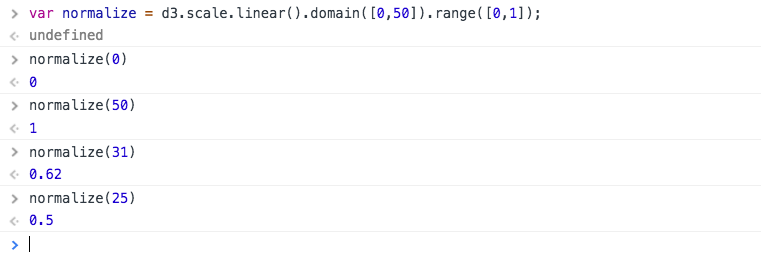
Now, having refreshed some of the important concepts, let’s learn some new topics.// Create a linear scale var normalize = d3.scale.linear().domain([0,50]).range([0,1]); Here domain(..) is used to set the max and min values of the input data and range(..) is used to set the max and min values of the output needed. A domain of [0,50] and a range of [0,1] means we have created a linear scale that’d map any value in [0,50] to a value in [0,1]. Let’s check how well our scale works :
D3 supports plenty of scales to cover almost all of your data needs. Read more here.
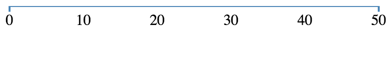
We will create an axis with the domain of data [0,50] and the
 range of our scale will be in [10,400].
Let’s look at the code to fit into our <svg> :


//create an svg element
var svgElement = d3.select("body")
.append("svg")
.attr({"width" : 500, "height" : 500});
//create a linear scale to map data to pixels, domain is [0,50] and range is [10,400]
var xScale = d3.scale.linear().domain([0,50]).range([10,400]);
//create a axis based on the scale
var xAxis = d3.svg.axis().scale(xScale)
.ticks(5) //limit number of ticks to 5
.orient("bottom"); //horizontal axis with labels to  the bottom
//create a new group to hold the axis
var x = svgElement.append("g")
.call(xAxis);
 Let’s beautify the axis a little by adding the following code to the CSS :
path{
stroke: steelblue;
fill: none;
stroke-width: 2;
}
 That looks quite better! I personally feel CSS is like “parameter tuning” of visualization with D3.
var xAxis = d3.svg.axis().scale(xScale)
.ticks(5) //limit number of ticks to 5
.orient("bottom"); //horizontal axis with labels to the bottom
We created an axis using d3.svg.axis() method. The scale() method then sets the scale to our newly created scale. ticks() sets the number of ticks our axis will have, the default is 10. The above axis without ticks(5) would look like :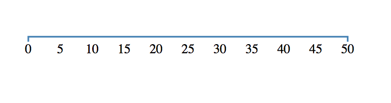
var x = svgElement.append("g")
.call(xAxis);
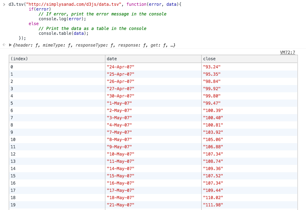
An axis a combination of many SVG elements that for its scale, ticks, labels etc. So it is better to group them using <g> in the SVG. That’s we appended a group and called xAxis() function to plot the axis. You can read more about axes in D3 here. Now that we know how to plot axes, let’s learn how to load external data into D3!d3.tsv("http://simplysanad.com/d3js/data.tsv", function(error, data){
if(error)
// If error, print the error message in the console
console.log(error);
else
// Print the data as a table in the console
console.table(data);
});
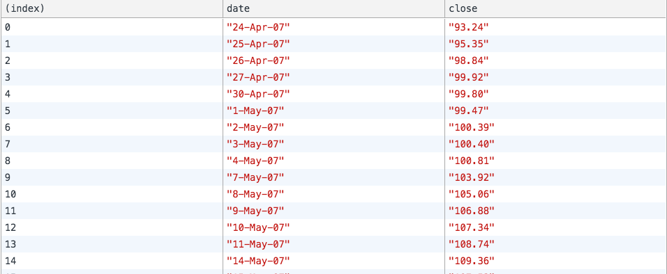
//Create a date parser
var ParseDate = d3.time.format("%d-%b-%y").parse;

//Read TSV file
d3.tsv("data.tsv", function(error, data){
//Parse Data into useable format
data.forEach(function(d){
d.date = ParseDate(d.date);
d.close = +d.close;
//the + sign converts numeric string to number
});

//Print the data as a table in the console
console.table(data);
});
Let’s view our data once again : 
//Create a line generator
var valueline = d3.svg.line()
.x(function(d){
return xScale(d.date);
})
.y(function(d){
return yScale(d.close);
});
<!DOCTYPE html>
<html>
<head>
<title>D3 Line Chart</title>
<style type="text/css">
body{ font: Arial 18px; text-align: center; }
path{
stroke: steelblue;
fill: none;
stroke-width: 2;
}
.axis path, .axis line{
fill: none;
stroke: grey;
stroke-width: 1;
shape-rendering: crispEdges;
}
</style>
<link rel="stylesheet" type="text/css" href="main.css">
</head>
<body>
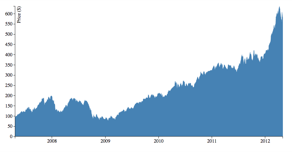
<h3>Basic Line Chart</h3>
<script type="text/javascript" src="https://d3js.org/d3.v3.js"></script>
<script type="text/javascript">
//Set margins and sizes
var margin = {
top: 20,
bottom: 50,
right: 30,
left: 50
};
var width = 700 - margin.left - margin.right;
var height = 500 - margin.top - margin.bottom;
//Create date parser
var ParseDate = d3.time.format("%d-%b-%y").parse;
//Create x and y scale to scale inputs
var xScale = d3.time.scale().range([0, width]);
var yScale = d3.scale.linear().range([height, 0]);
//Create x and y axes
var xAxis = d3.svg.axis().scale(xScale)
.orient("bottom")
.ticks(5);
var yAxis = d3.svg.axis().scale(yScale)
.orient("left")
.ticks(5);
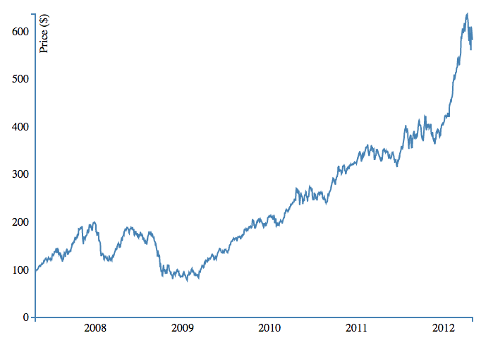
//Create a line generator
var valueline = d3.svg.line()
.x(function(d){
return xScale(d.date);
})
.y(function(d){
return yScale(d.close);
});
//Create an SVG element and append it to the DOM
var svgElement = d3.select("body").append("svg")
.attr({"width": width+margin.left+margin.right, "height": height+margin.top+margin.bottom})
.append("g")
.attr("transform","translate("+margin.left+","+margin.top+")");
//Read TSV file
d3.tsv("http://simplysanad.com/d3js/data.tsv", function(data){
//Parse Data into useable format
data.forEach(function(d){
d.date = ParseDate(d.date);
d.close = +d.close;
//the + sign converts string automagically to number
});

//Set the domains of our scales
xScale.domain(d3.extent(data, function(d){ return d.date; }));
yScale.domain([0, d3.max(data, function(d){ return d.close; })]);

//append the svg path
var path = svgElement.append("path")
.attr("d", valueline(data));

//Add X Axis
var x = svgElement.append("g")
.attr("transform", "translate(0,"+height+")")
.call(xAxis);

//Add Y Axis
var y = svgElement.append("g")
.call(yAxis);

//Add label to y axis
y.append("text")
.attr("fill", "#000")
.attr("transform", "rotate(-90)")
.attr("y", 6)
.attr("dy", "0.71em")
.attr("text-anchor", "end")
.text("Price ($)");
});
</script>
</body>
</html>
<!DOCTYPE html>
<html>
<head>
<script type="text/javascript" src="https://d3js.org/d3.v3.js"></script>
<style>
body{ font: Arial 12px; text-align: center;}
.axis path, .axis line{
fill: none;
stroke: black;
stroke-width: 1;
shape-rendering: crispEdges;
}
</style>
<link rel="stylesheet" type="text/css" href="main.css">
</head>
<body>
<h3>Area Chart</h3>
<script type="text/javascript">
//Set margins and sizes
var margin = {
top: 20,
bottom: 50,
right: 30,
left: 50
};

var width = 960 - margin.left - margin.right;
var height = 500 - margin.top - margin.bottom;
//Create date parser
var ParseDate = d3.time.format("%d-%b-%y").parse;
//Create x and y scale to scale inputs
var xScale = d3.time.scale().range([0, width]);
var yScale = d3.scale.linear().range([height, 0]);

//Create x and y axes
var xAxis = d3.svg.axis().scale(xScale)
.orient("bottom")
.ticks(5);

var yAxis = d3.svg.axis().scale(yScale)
.orient("left");

//Create a area generator
var area = d3.svg.area(
.x(function(d){
return xScale(d.date);
})
.y1(function(d){
return yScale(d.close);
});

//Create an SVG element and append it to the DOM
var svgElement = d3.select("body")
.append("svg").attr({"width": width+margin.left+margin.right, "height": height+margin.top+margin.bottom})
.append("g")
.attr("transform","translate("+margin.left+","+margin.top+")");

//Read TSV file
d3.tsv("http://simplysanad.com/d3js/data.tsv", function(data){
//Parse Data into useable format
data.forEach(function(d){
d.date = ParseDate(d.date);
d.close = +d.close;
//the + sign converts string automagically to number
});

//Set the domains of our scales
xScale.domain(d3.extent(data, function(d){ return d.date; }));
yScale.domain([0, d3.max(data, function(d){ return d.close; })]);
area.y0(yScale(0));
//append the svg path
var path = svgElement.append("path")
.attr("d", area(data))
.attr("fill", "steelblue");
//Add X Axis
var x = svgElement.append("g")
.attr("transform", "translate(0,"+height+")")
.attr("class", "x axis")
.call(xAxis);

//Add Y Axis
var y = svgElement.append("g")
.call(yAxis)
.attr("class", "y axis");

//Add label to Y axis
y.append("text")
.attr("fill", "#000")
.attr("transform", "rotate(-90)")
.attr("y", 6)
.attr("dy", "0.71em")
.attr("text-anchor", "end")
.text("Price ($)");
});
</script>
</body>
</html>
Notice that we have only made the following changes : 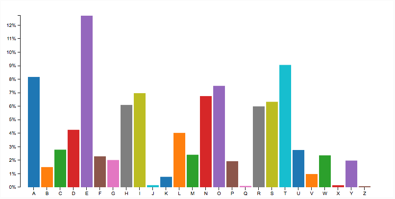
<!DOCTYPE html>
<html>
<head>
  <script src="d3.min.js"></script>
  <style type="text/css">
    .axis path,
    .axis line {
      fill: none;
      stroke: #000;
      shape-rendering: crispEdges;
    }
    .x.axis path{
      display: none;
    }
    body{
    font: 10px arial;
     text-align: center;
    }
  </style>
  <link rel="stylesheet" type="text/css" href="main.css">
</head>
<body>
  <h1>Animated Barchart</h1>
  <script type="text/javascript">
    //Set up margin and percentage formatter
    var margin = {top:20, right: 30, bottom: 30, left:40};
    var width = 800-margin.left-margin.right;
    var height = 400-margin.top-margin.bottom;

    //Creating a percentage formatter
    var formatPercent = d3.format("%.0");

     //Create x and y scale
    var yScale = d3.scale.linear().range([height,0]);
    var xScale = d3.scale.ordinal().rangeRoundBands([0,width],0.1,0.2);

    //Create category 10 scale for color
    var c10 = d3.scale.category10();
In the above code, we started out by setting up basic margins and width, height values. Then we created a percentage formatter using D3’s format(..) so that we can convert our y axis labels to %. Then we defined scales for x and y axis and defined the range for the same. Lastly, since we would be needing color for our bars, we will use one of D3’s color bands, category10. The category10 contains the following 10 colors : 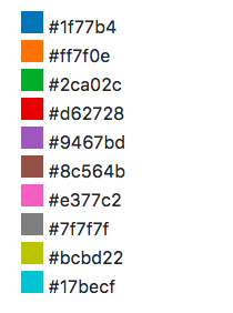
    //Create SVG Element
    var svg = d3.select("body")
          .append("svg")  .attr({"width":width+margin.left+margin.right,"height":height+margin.top+margin.bottom})
          .append("g")
          .attr("transform","translate("+margin.left+","+margin.right+")");
d3.tsv("http://simplysanad.com/d3js/words.tsv", function(data){});
Remember some preprocessing of data? Now that we get our data, we need to set the domain of our x and y scales which we couldn’t set earlier because we didn’t have the data: //Set domain of x and y scales based on loaded data
yScale.domain([0,d3.max(data, function(d){ return d.frequency; })]);
xScale.domain(data.map(function(d){ return d.letter; }));
//Load data from external tsv file
d3.tsv("http://simplysanad.com/d3js/words.tsv", function(data){
 //Set domain of x and y scales based on loaded data
      yScale.domain([0,d3.max(data, function(d){ return d.frequency; })]);
      xScale.domain(data.map(function(d){ return d.letter; }));
//Create X and Y Axis based on scales and data
var xAxis = d3.svg.axis()
.scale(xScale)
.orient("bottom");
var yAxis = d3.svg.axis()
.scale(yScale)
.orient("left")
.tickFormat(formatPercent);
//Add bars
var bars = svg.selectAll("rect")
.data(data)
.enter()
.append("rect")
.attr("class","bar")
.attr("width", xScale.rangeBand())
.attr("fill","steelblue")
.attr("fill", function(d,i){
return c10(Math.random()*10*i);
})
.attr("y", function(d){
return yScale(d.frequency);
})
.attr("x", function(d){
return xScale(d.letter);
})
                   .attr("height", function(d){
                      return height-yScale(d.frequency);
                   });

     //Add X Axis
     svg.append("g")
     .attr("transform","translate(0,"+height+")")
     .call(xAxis)
     .attr("class","x axis");
      //Add Y Axis
      svg.append("g")
        .attr("class", "y axis")
        .call(yAxis);
    });
  </script>
</body>
</html>
Now that you have the basic chart drawn, it is time for you to jump into action and do something creative!


<!DOCTYPE html>
<html>
<head>
<script type="text/javascript" src="d3.min.js"></script>
<style>
body{ font: Arial 12px; text-align: center;}
.link {
stroke: #ccc;
}
.node text {
pointer-events: none;
font: sans-serif;
}
</style>
<link rel="stylesheet" type="text/css" href="main.css">
</head>
<body>
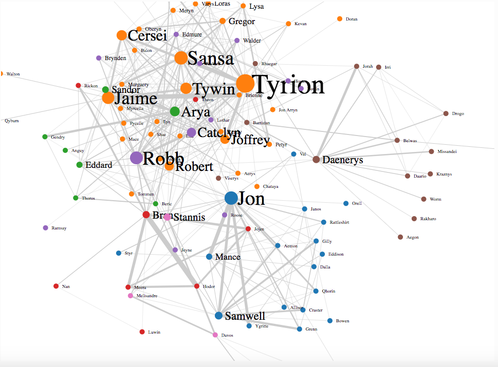
<h3>Game of Thrones-Social Network Analysis</h3>
<script type="text/javascript">
Step 2. Setting the stage//Set margins and sizes
var margin = {
top: 20,
bottom: 50,
right: 30,
left: 50
};
var width = 960 - margin.left - margin.right;
var height = 700 - margin.top - margin.bottom;
//Load Color Scale
var c10 = d3.scale.category10();
Step 3. No visualization specific code//Create an SVG element and append it to the DOM
var svgElement = d3.select("body")
.append("svg").attr({"width": width+margin.left+margin.right, "height": height+margin.top+margin.bottom})
.append("g")
.attr("transform","translate("+margin.left+","+margin.top+")");
Step 5. Load external data//Load External Data
d3.json("http://simplysanad.com/d3js/got_social_graph.json", function(dataset){
//Extract data from dataset
var nodes = dataset.nodes,
links = dataset.links;
Step 6. Bringing it all together – force layout, nodes, links//Create Force Layout
var force = d3.layout.force()
.size([width, height])
.nodes(nodes)
.links(links)
.gravity(0.05)
.charge(-200)
.linkDistance(200);
//Add links to SVG
var link = svgElement.selectAll(".link")
.data(links)
.enter()
.append("line")
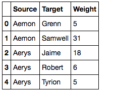
.attr("stroke-width", function(d){ return d.weight/10; })
.attr("class", "link");
//Add nodes to SVG
var node = svgElement.selectAll(".node")
.data(nodes)
.enter()
.append("g")
.attr("class", "node")
.call(force.drag);
Step 7. Adding extras – Labels, Starting the simulation//Add labels to each node
var label = node.append("text")
.attr("dx", 12)
.attr("dy", "0.35em")
.attr("font-size", function(d){ return d.influence*1.5>9? d.influence*1.5: 9; })
.text(function(d){ return d.character; });
//Add circles to each node
var circle = node.append("circle")
.attr("r", function(d){ return d.influence/2>5 ? d.influence/2 : 5; })
.attr("fill", function(d){ return c10(d.zone*10); });
//This function will be executed once force layout is done with its calculations
force.on("tick", function(){
//Set X and Y of node
node.attr("r", function(d){ return d.influence; })
.attr("cx", function(d){ return d.x; })
.attr("cy", function(d){ return d.y; });
//Set X, Y of link
link.attr("x1", function(d){ return d.source.x; })
link.attr("y1", function(d){ return d.source.y; })
link.attr("x2", function(d){ return d.target.x; })
link.attr("y2", function(d){ return d.target.y; });
//Shift node a little
node.attr("transform", function(d) { return "translate(" + d.x + "," + d.y + ")"; });
});
//Start the force layout calculation
force.start();
});
</script>
</body>
</html>
What’s happening here?//Create Force Layout var force = d3.layout.force() .size([width, height]) .nodes(nodes) .links(links) .gravity(0.05) .charge(-200) .linkDistance(200);
//This function will be executed for every tick of force layout
force.on("tick", function(){
//Set X and Y of node
node.attr("r", function(d){ return d.influence; })
.attr("cx", function(d){ return d.x; })
.attr("cy", function(d){ return d.y; });
//Set X, Y of link
link.attr("x1", function(d){ return d.source.x; })
link.attr("y1", function(d){ return d.source.y; })
link.attr("x2", function(d){ return d.target.x; })
link.attr("y2", function(d){ return d.target.y; });
//Shift node a little
node.attr("transform", function(d) { return "translate(" + d.x + "," + d.y + ")"; });
});
The above code basically tells D3 for every “tick” (single step of the simulation), redraw(updated) all the nodes and their links. Now when everything is done, we start the simulation : //Start the force layout simulation force.start();If you want to dig deeper into force layouts, you can read its documentation here. With this, you have your very own GoT Social Graph!
Source Link
What would you do if you want to show 3-dimensional data in 2 dimensions? You’d use a bubble chart! The area of the circle and the x and y coordinates are used to encode all the 3 dimensions.
Source Link
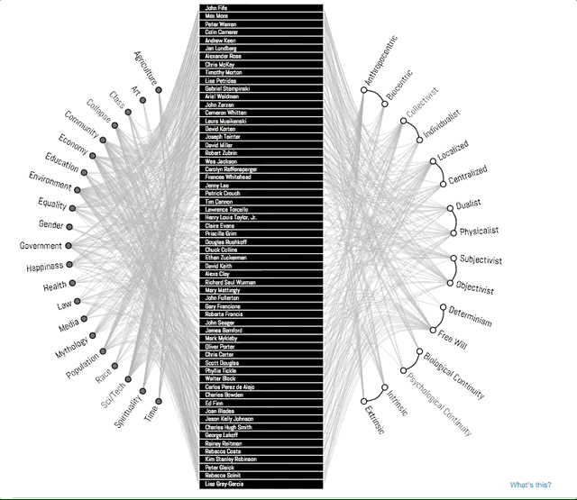
A concept map typically represents ideas and information as boxes or circles, which it connects with labeled arrows in a downward-branching hierarchical structure. The relationship between concepts can be articulated in linking phrases such as causes, requires, or contributes to. In this example, D3 is used to show an improvised concept map to better convey the story. Notice how the branches get highlighted when you select a topic. This is a good example of interactivity D3 enables in your visualizations.
Source Link
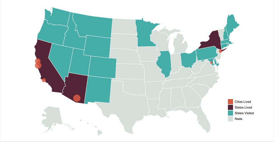
D3 provides amazing in built support to create interactive, map based visualizations that can be used to show demographically distributed data.
Source Link
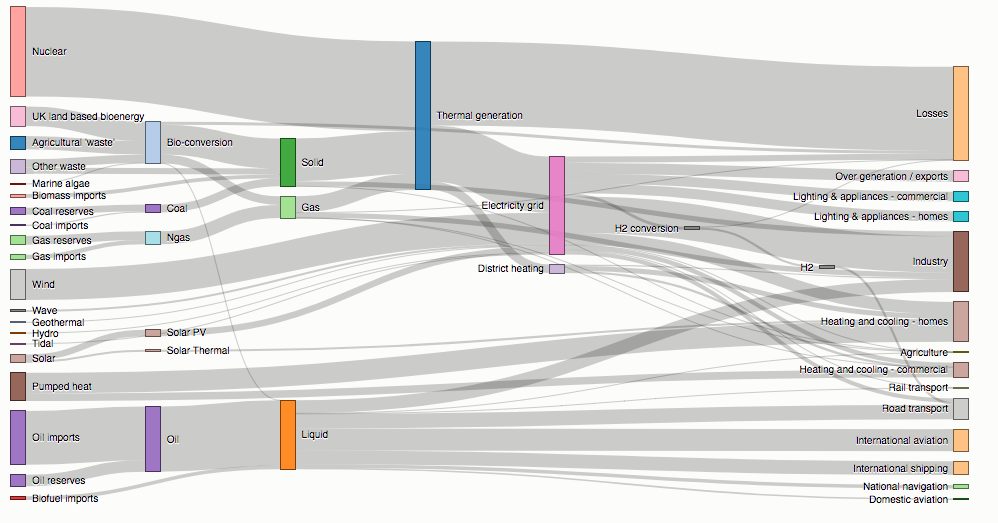
Sankey diagrams visualize the magnitude of flow between nodes in a network. This intricate diagram shows a possible scenario for UK energy production and consumption in 2050: energy supplies are on the left, and demands are on the right. Intermediate nodes group related forms of production and show how energy is converted and transmitted before it is consumed (or lost!). The thickness of each link encodes the amount of flow from source to target.
Source Link
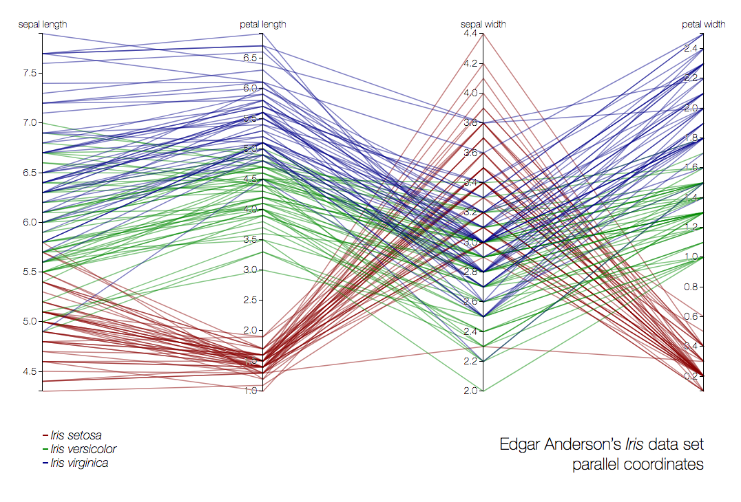
Parallel coordinates is a visualization technique used to plot individual data elements across many dimensions. Each of the dimensions corresponds to a vertical axis and each data element is displayed as a series of connected points along the dimensions/axes. In the above example, the very famous iris dataset is plotted.
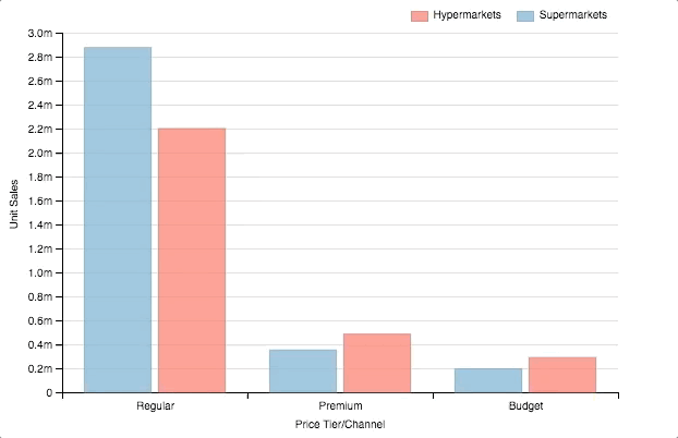
<html>
<div id="chartContainer">
  <script src="https://d3js.org/d3.v4.min.js"></script>
  <script src="http://dimplejs.org/dist/dimple.v2.3.0.min.js"></script>
  <script type="text/javascript">
    //Create the SVG
    var svg = dimple.newSvg("#chartContainer", 590, 400);

    //Load external data
    d3.tsv("http://dimplejs.org/data/example_data.tsv", function (data) {
      //Create a chart object using svg and data
      var myChart = new dimple.chart(svg, data);
      //Set the size of the plot within SVG
      myChart.setBounds(60, 30, 510, 330
      //Add an axis of categorical values
      myChart.addCategoryAxis("x", ["Price Tier", "Channel"]);
      //Add an axis of continuous values
      myChart.addMeasureAxis("y", "Unit Sales");
      //Make a barchart
      myChart.addSeries("Channel", dimple.plot.bar);
      //Add legends
      myChart.addLegend(65, 10, 510, 20, "right");
      //Draw the chart
      myChart.draw();
    });
  </script>
</div>
</html>